Introduction
As a web developer you must have encountered a situation where you needed to decide whether you should go with CSS flexbox or CSS grid layout method for the layout of your web pages. To decide which one to use is a very difficult task unless you know the basics of these layout methods. A lot of people use these layout methods without actually knowing the reason why they are using one and not the other.Mostly people choose one of these methods depending on how good they are at using it. The main motivation behind writing this article is to help you understand basics of these layout methods and which one to use depending upon particular situation.
There are a lot of similarities between CSS flexbox and grid layout methods. Both these methods are used for defining the layout of the web pages and are much more powerful than other layout techniques. The basic difference between CSS flexbox layout and Grid layout is that flexbox was designed for layout in one-dimension either a row or a column but the grid layout method was designed for two-dimensional layouts i-e defining rows and columns at the same time. Let us have a look at both the layout methods one by one to know more about them.
Flexbox Layout Method
CSS flexbox is a one-dimensional layout pattern that makes it easy to design flexible and effective layouts. The flexbox layout is used to make the elements to be properly placed and behave predictably on different screens sizes. Flexbox items are positioned inside a flex container along a flex line. By default, there is only one flex line per flex container.
Terminology Used In Flexbox
Here are the basic terms that you need to be familiar with in order to understand how the flexbox works:
- main-axis: The main-axis is the primary axis of the flex container along which flex items are aligned.
- main-start | main-end: The flex items are placed or set inside the container beginning with main-start and going up to main-end.
- cross-axis: Cross-axis is referred to as the axis perpendicular to the main axis, and its direction depends on the main axis direction.
Using Flexbox Layout Method
In order to use the flexbox layout method you need to set the display property of the parent container to value flex. Let us see with an example how we can do this.
main {
    display: flex;
}
Here we have set the main to behave as flexbox so anything within main will be treated as flex-items.
Properties Applied on Flex-container
Here are some of the main properties that can be applied on flex-container.
- flex-direction Flex-direction property defines the direction of flex items inside the flex- container.This defines the direction of the main-axis and cross-axis. It can take many values like row(default)| row-reverse | column | column-reverse. Example
flex-direction: column;
- flex-wrap The flex-wrap property defines whether the flex-items will be forced to stay in a single line or span in multiple lines. It can take may values like : wrap| nowrap(default) | wrap-reverse. Example
flex-wrap: wrap;
- justify-content This property is used to align the flex-items within the flex container along main-axis. It can take many values like: flex-start | flex-end | center | space-between | space-around. Example
justify-content: space-between;
- align-items This allows you to align the flex-items inside the flex container along the cross-axis. The values it can take are: flex-start | flex-end | center | baseline | stretch. Example
align-items: center;
- flex-flow It is the shorthand for writing the flex-direction and flex-wrap properties.The first value sets the direction and second value sets the flex-wrap property. Example
flex-flow: column wrap;
Properties Applied on Flex-items
There are number of properties that can be applied on flex-items. Some of the most commonly used properties are:
- flex-grow This value of this property is a number that specifies how much items will grow relative to the rest of the flexible items.
flex-grow : 1 ;
- flex-shrink The value of this property is a number that specifies how much items will shrink relative to the rest of the flexible items.
flex-shrink: 0 ;
- flex-basis It sets the initial main size of flex items. Legal values of flex basis are: auto, inherit, or a number followed by %, em, px or any other length unit.
flex-basis: 200px;
- order By default the items within the flex- container are paced in order of their occurrence in html code but we can change their order by specifying the order property on the flex-item.The order property of CSS can be used for ordering flex items. It specifies the order of a flex item with respect to the other flex items.
order: 3 ;
- flex It is a shorthand property for flex-grow, flex-shrink, flex-basis.
flex: 1 0 300px;
This sets flex-grow =1, flex-shrink = 0 and flex-basis = 300px.
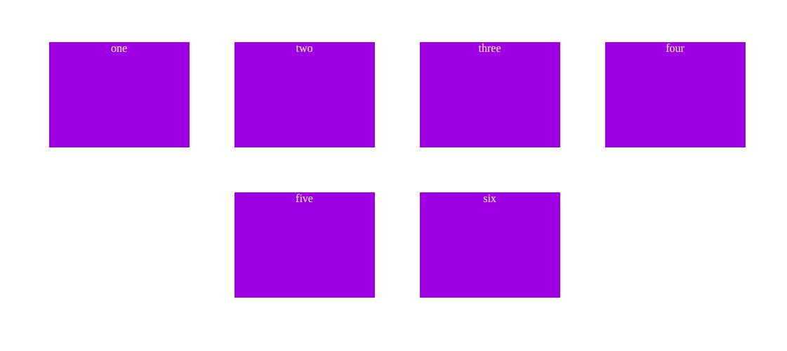
Consider the markup as shown below
<div class="container">
     <div class="items">one</div >
     <div class="items">two</div >
     <div class="items">three</div>
     <div class="items">four</div>
     <div class="items">five</div>
     <div class="items">six</div>
</div>
Let us try to use some of the above properties now.
.container {
    display: flex;
    flex-wrap: wrap;
    justify-content: center;
    align-items:center ;
}

.items {
    width: 200px;
    height: 150px;
    margin: 2rem;
    background-color: blueviolet;
    color: whitesmoke;
    text-align: center;
}
The output of this code looks like this:
Introduction to CSS Grid Layout Method
CSS grid layout method was designed particularly for two-dimensional layout.Any html element is said to be defined as grid when its display property has been set to grid. Example consider the markup as given:
.container {
    display: grid;
}
When you set the display property to grid, the items within this container are treated as grid items, but you need to specify the grid columns and grid rows for the layout to work. This is done by setting grid-template-columns and grid-template-rows to a value as
.container {
        display: grid;
        grid-template-columns : 1fr 1fr 1fr;
        grid-template-rows: repeat(2, 150px);
}
You can use any length unit like em, rem, px. The one used here is Fr. It is a fractional unit and 1fr is for 1 part of the available space. In grid-template-rows the repeat() function has been used.The repeat() function can be used with grid-template-rows or grid-template-column properties to make our rules more concise and easier to understand when creating a large amount of columns or rows.Like flex-box there are a number of properties that you can use with CSS grids. Here are some of the properties that you can use with CSS grids.
Properties Applied on Parent(Grid Container)
- grid-template-columns: Defines the number of columns in the grid with a list of values seperated by a space. The number of values represent the number of columns and the value represents their width.
grid-template-columns: repeat(4, 1fr);
- grid-template-rows: Defines the number of rows in the grid with a list of values seperated by a space. The number of values represent the number of columns and the value represents their height.
grid-template-rows: repeat(2, 200px);
- grid-template-areas: It defines the grid template by referencing the names of grid-areas which are specified by grid-areas property(property of grid item).
grid-template-areas: "header header header nav"
                                   "main main article sidebar"
                                   "footer footer footer nav";
- gap: It defines the gap between the rows and columns. If two values are given, the first one corresponds to row-gap value and second one corresponds to column-gap value.
gap: 20px;
- justify-content and align-content: This property aligns the grid along the inline (row) axis and align-content aligns the grid along the block (column) axis).
justify-content: center;
align-content: center;- justify-items: It is used to align the grid items along the horizontal line inine (row-axis). It can take many values like center| space-evenly| space-around| space-between |start | end.
justify-items: end;- align-items: It is used to align the grid items along the vertical lines block (column-axis).It can also take many values like start | end | center | stretch.
align-items: center;- place-items: It is a shorthand property for justify-items and align-items. When given two values the first one represents the align-items value and second one represents the justify-items value.
place-items: start;
Properties of Grid-Items
Here is the list of properties that are applied on grid items:
- grid-area: It is used to name a grid item so that it can be referenced by grid-template-areas in the parent container. Grid-areas make media queries easier to write and result in shorter code.
- justify-self: It aligns the grid item within the cell along row-axis.
- align-self: It aligns the grid-item within the cell along column-axis.
- sub-grid: It allows the grid-items to create their on grids within the main grid.Thus allowing you to create a very complex layout using this feature.
- grid-column: This property is used to locate the grid-items along the columns . It takes a numeric value representing the column number for the grid-item.
- grid-row: This property is used to locate the grid-items along the rows . It takes a numeric value representing the row number for the grid-item.
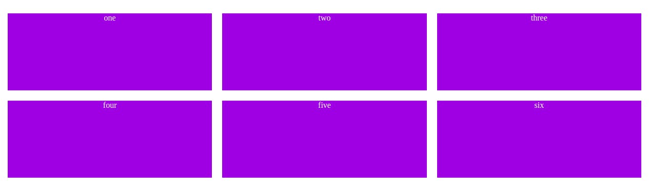
Now let us try to use some of the above properties on our example for that consider the following markup
<div class="container">
     <div class="items">one</div >
     <div class="items">two</div >
     <div class="items">three</div>
     <div class="items">four</div>
     <div class="items">five</div>
     <div class="items">six</div>
</div>
Applying properties on parent container:
.container {
        display: grid;
        grid-template-columns : 1fr 1fr 1fr;
        grid-template-rows: repeat(2, 150px);
        gap: 20px;
}
Now let us move on to adding style to our grid items
 .items {
        background-color: blueviolet;
        color: whitesmoke;
        text-align: center;
}
Once the above styles are applied the layout generated will look like this :
Flexbox or Grid Which One to Use
Now that you know the basics of the flexbox and grid layout methods, let us try to find out which of layout should we use in our web pages.
The flexbox layout should be used mainly:
- When your design is primarily the content based.
- When you do not know how your content will work on the web page and you just want everything to fit in.
- When you are designing a small scale layouts and application components.
The Grid layout should be used mainly:
- When the design of your web page is layout oriented.
- When you have complex design to work with and you want easily maintainable web page
- Grid layout is better at overlapping items so use it when overlapping is your concern in the web pages.
- When you want to add gaps over the block level elements on your web page.